Being able to offer a good user experience is the ultimate goal for any designer. Fundamentally, if you’re a good UX designer, you try to learn what users want and deliver the best for the users. However, at times, clients don’t care about their end-users (customers) and focus largely on their growth agenda and business goals. Such a company’s agenda is simple, dark UX to lure people into buying or subscribing to their services. They think at least in the short term, it is worth doing so for business gains. So, companies deceive dark patterns into the design as traps for users.
What is Dark UX?
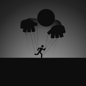
Dark user experience is any sort of design that is designed without any ethical values but just to confuse the end-users. It drives the users forcefully to perform a task that favors and elevates the business goals. These kinds of actions are more of forcing the user to perform a task that can support their business rather than supporting the design and its values.
Dark UX is a deceptive pattern that forces users to take action or commit to things that they don’t need or want at the moment. These actions are usually more beneficial to the companies than the users and I think it could be avoided by simply building better relationships with the users.
Dark UX is not Bad UX
Bad UX is accidental. It is a bad design from a lack of knowledge in design. Whereas, dark UX is intentional and purposely designed to promote the brand’s best interests at the user’s expense.
- Bad UX: Confusing checkout processes.
- Dark UX: Purposefully making it difficult to find the “x” that closes a pop-up.
The difference between the two is the intention. Brands that use dark UX know exactly what they’re doing. They are well aware of the UX concepts that make websites great and use that knowledge to manipulate their users.
Some commonly used dark patterns are identified and listed below.
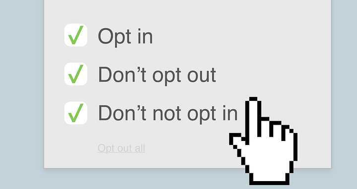
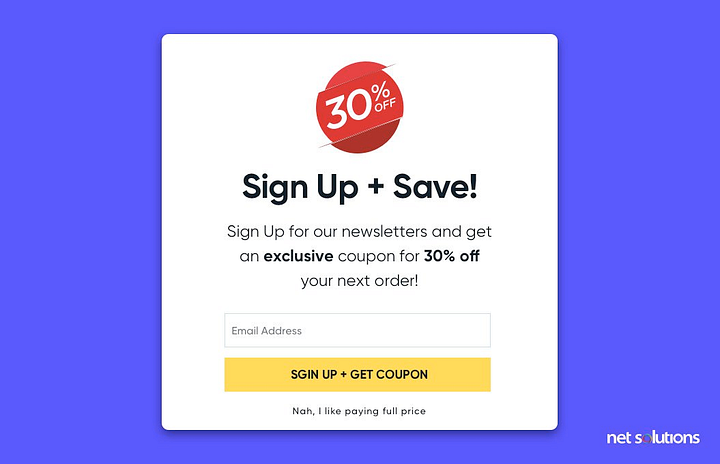
1. Trick questions
Trick questions are asked intentionally to trigger the user to answer the question which they are not willing to answer. For example, leave a tip of $30 if you like the food. Here the tip box or icon is already highlighted and drives the user to pay the tip. It is confusing yet goal-oriented. Most of the subscriptions in websites or apps ask us to subscribe to their newsletter and that is an unavoidable trigger. Most users fall prey to such dark UX.
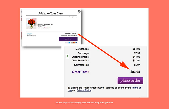
2. Sneak in unwanted items
Some websites and business apps sneak unwanted items into the user’s cart or to their preferences. This is one of the best examples of dark UX as it forces users to buy items without their knowledge.
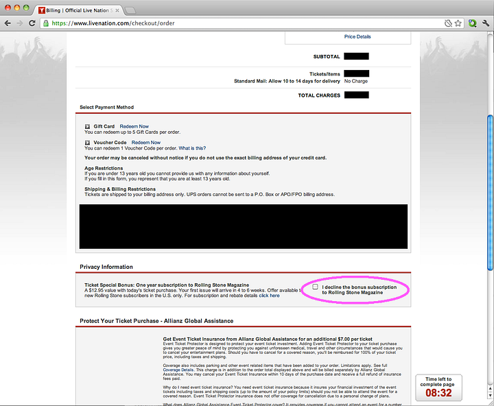
3. Roach motel
This is named after Roach, it is the process of making a simple process difficult. When you click on the “subscription” plan just to see the features and forgot to leave the tab without checking out, you are in the “Roach Motel”. This trick is a trap for the user to get signups and subscriptions. Mostly the companies ask users to sign up for free trials and after 3 days most of them forget about the membership or subscriptions and end up paying money for it.
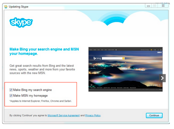
4. Privacy zuckering
Most of the users don’t have time to read the terms and conditions or privacy policies. They just click on agree and move on. This leads to companies selling the user’s data to private companies.
5. Price comparison prevention
Some companies or brands make it difficult for the user to think, compare, and buy their product with others. This forces the users to buy the product without comparing. For example, LinkedIn uses this trick to confuse its user while comparing its subscription plans.
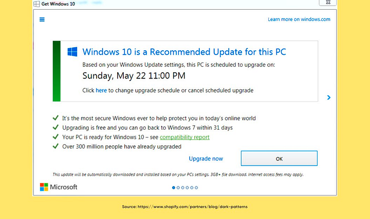
6. Misdirection
Having a big triggering button will draw the attention of the user at any cost. Brands place their triggers in the button with bright and bold colors and redirect them to the desired pages. The redirected pages could be completely irrelevant to the purpose of the search but suit the company’s business goals.
7. Hidden costs
The Hidden cost is very similar to sneaking in the item type, it just has some hidden cost in every product from that brand and manipulates the user to buy that product without informing about the hidden cost. Most website builders have such hidden cost methods or tricks.
8. Bait and switch
Bait and switch is when we intend to do something and ended up doing other things. For example., Youtube or website ads, when a user wants to download something and clicks a hyperlink which will end up in downloading some other stuff.
9. Confirm shaming
Playing with the emotions, confusing and forcing the user to take action which they don’t want to do. This is called confirm shaming. An example of this is a subscription to a newsletter.
10. Friend spam
Few brands integrate with users’ social media and access their contact lists. They use those contact information to spam and promote their product and brand.
Thought-provoking insights from real users
- Philip sander says “Every website that asks you to allow cookies. They could easily say allow or refuse. Instead, they have to “manage your cookies” and then present you with a deliberately intimidating page of sliders already turned on, with dense jargon connected to each one. If you manage to fight through that mess turning off every cookie individually, you “use your preferences” and never reject cookies. They keep the vocabulary deliberately dense and never allow you a negative response. They then choose not to save your preferences for the next time you visit that page. Instead of asking you every time you uniquely visit (it’s your browser that stores your preferences, not the page).”
- Bijo finds an issue with Instagram’s UX. In Instagram, if we are trying to share something like a story, and if you are already logged in on your Facebook account also from the same mobile device, Instagram will automatically select the Share to Facebook option. If we didn’t unmark that sharing option, the same content will be shared on Facebook also as a story. This is a clear example of a UX dark pattern, forcing us to post something on Facebook and also increase Facebook engagement. But recently they have changed this option because more users are finding it irritating.
- Greta has a lot to say,
“- Adding items to the cart without your action.
– Adding taxes or extra payment in the last step or only in the backlink.
– Automatic subscription, e.g. you buy one item and it says you just subscribed to monthly deliveries.
– Trails with an auto-subscription.
– Price changes after registration.
– Not showing prices before registration.
– Showing items as available before registration, but not available after it.
– Forcing people to register and afterward telling them “You can not buy this in your location”.
– Forcing donations in the basket.
– Hiding discount step at the bottom of the page of purchase.
– Promising free delivery and once you add items, saying “This item is too big to deliver”.” - “See how the pattern exploits cognitive biases like loss aversion. People generally don’t like to lose. Others are scarcity, anchoring effect, and fear of missing out. Some other harmful practices are guilt-tripping, loot boxes tied to monetization, auto-play, and paying to remove discomfort (those damn ads..). Hoping that it helps.” Says, Nikoleta.
Summary
Dark patterns are everywhere. From a user experience point of view, it has a direct impact on the users. So, it is seen as one of the most important issues in recent days. Every business follows dark UX patterns to push their business to their customers. It is extremely important to avoid these patterns to establish credibility and transparency with the users. A good UX design will always attract customers organically without any deceit.
Reference:
- https://www.wired.com/story/how-to-spot-avoid-dark-patterns/
- https://careerfoundry.com/en/blog/ux-design/dark-patterns-ux/
- https://www.thecreativemomentum.com/blog/ethics-of-design-are-you-socially-responsible-for-user-habits
- https://www.thecreativemomentum.com/blog/9-ux-and-ui-design-concepts-you-should-understand-as-a-manager
- https://www.thurrott.com/windows/windows-10/67367/upgradegate-microsofts-upgrade-deceptions-undermining-windows-10
- https://www.linkedin.com/feed/update/urn:li:activity:6947481274521460737/?commentUrn=urn%3Ali%3Acomment%3A(groupPost%3A3209228-6947120381539274753%2C6947611007661846529)&dashCommentUrn=urn%3Ali%3Afsd_comment%3A(6947611007661846529%2Curn%3Ali%3AgroupPost%3A3209228-6947120381539274753)