We are all pretty familiar with colors and at some point in our lives, we all have worked with colors as well. It might have been drawing with crayons in early childhood or using different color mediums in paintings.
Feeling nostalgic thinking of childhood? Or, did a color remind you of a special childhood memory? Your red toy car, pink pencil case, or blue teddy bear! Well, that’s the magic of colors. They are everywhere and play a very important role in our lives. With the help of colors, we can communicate our feelings and ideas to others. Similarly, in design, colors help us to communicate the function of a design element to users.
Color psychology
Right colors can completely enhance the look and feel of anything. Each color has its psychological effects. It can influence our moods, convey messages, and grab the attention of people using a product.
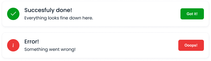
In the example below, we can tell the status of the notifications even before reading them. It’s because somewhere in our brain we already know that green is for safety or a positive action and red is for danger, wrong, or negative action.
Importance of colors in branding
Choosing a color for your logo or brand is extremely important and should not be taken lightly. It plays a crucial role in the success or mass appeal of your brand/product.
- It represents your business and brand.
- It helps people remember you.
- It makes you unique from other brands and creates brand value.
For example, the color red with white scripted text on it reminds us of the brand Coca-Cola. The color red is for energy, excitement, and power. It also stimulates the appetite, which makes it an excellent choice when branding food or drink.

Start with Identifying the right colors for your brand
First start with identifying who are the users, what is the purpose of your design and what you want to communicate with your design?
Select the colors that best represent your business and brand. It is important to choose wisely because brand colors are important.
Let’s pick colors for a horse riding app. Think what colors come to your mind when imagining a horse and a trail.

Why did we choose these two colors?
Brown — Brown is the most common color in most horse breeds. And we instinctively correlate the brown color with nature and earth. We even often associated the color with security and adventures.
Green — It is a dominant color in nature that makes you think of growth and it is associated with plants, trees, grass, refreshment, peace, rest, and life.
Now we have two reference colors for our brand to start with — brown and green.
Creating colors with the help of color theory
Color theory is the collection of rules and guidelines with the help of which we can create more colors by adding two or more colors. To create the best appealing color we can use the color wheel.
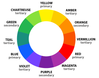
Red, blue, and yellow are the primary colors. By combining two primary colors we get secondary colors and with the combination of secondary colors, we get tertiary colors.
Now to create a color palette, we will use reference colors that we have got for our horse riding app. We can now generate more colors with the help of the color wheel. You can do it manually by picking colors one by one related to your reference colors just like an artist. Or, you can do it with the help of some online tools also, ex. https://coolors.co. And when you have a range of colors related to your reference colors, you can now choose primary and secondary brand colors from them. For primary color, look for a single color that best represents your business/brand based on the meaning of the color. You can experiment with different shades and tints of the color to find the perfect look. Once you have your primary color, pick one or more colors to go along with it, which will be our secondary colors.
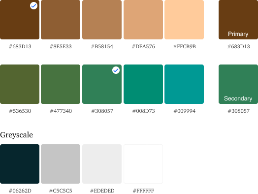
Let’s try our colors on a dummy logo. This logo is made with the help of using primary, secondary and a greyscale color.

Looking good right? Now, it’s time to create your own. Just take all your color inspiration and create color palettes out of them. Generating colors is all about experiments, the more you try the more you get better.
Good Luck! 🙂