What is color blindness?
In simple words, when people can’t see differences in colors, that is called color blindness.
Facts about color blindness
There are an estimated 300 million people in the world with color vision deficiency. 1 in 12 men are color blind (8%) and 1 in 200 women are color blind (0.5%).
Types of color blindness
There are three types of color blindness found so far.
1. Red-green color blindness
This is the most common type of color blindness. It makes it hard to tell the difference between red and green. It has four types:
Deuteranomaly: It makes the green look redder.
Protanomaly: It makes red look more green and less bright.
Protanopia and Deuteranopia: Both conditions make it unable to tell the difference between red and green at all.
2. Blue-yellow color blindness
This is a less common type of color blindness that makes it hard to tell the difference between blue and green, and between yellow and red. It has two types:
Tritanomaly: It makes it hard to tell the difference between blue and green, and between yellow and red.
Tritanopia: This condition makes it unable to tell the difference between blue and green, purple and red, and yellow and pink.
3. Complete color blindness (Monochromacy)
This is the rarest type of color blindness, it is also called monochromacy, and it’s quite uncommon where a person is unable to identify any color.

How to design for better color accessibility?
Here, I’ll try to cover some of the elements for a colorblind-friendly UX:
1. Use text labels along with color filters
Always add text labels with color filters to improve color accessibility for people with normal vision or color blindness.

2. Use both colors and symbols
Use both colors and symbols where users’ attention is required. Because it is difficult or even impossible to see common red error messages.

3. Use underline for links
Always add an underline to the text links, because it makes it easy to immediately tell the regular text and hyperlink text apart as shown in the images below.

4. Use minimum colors and avoid bad color combinations
Use minimum colors in your design to avoid confusion and also avoid the combinations mentioned below:

5. Use a better chart design
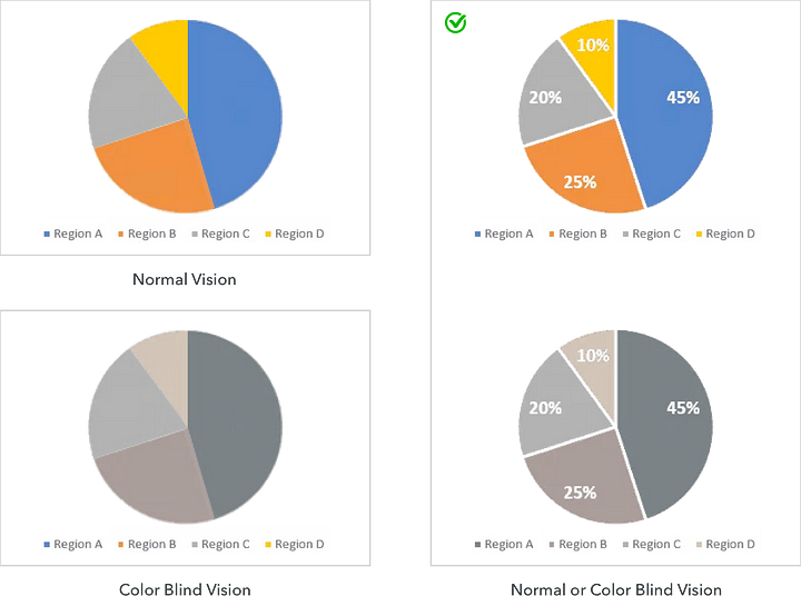
There are many types of charts and graphs available like bar charts, pie charts, line graphs, and so on, where color-coding can be problematic for users with color blindness.
This can be improved by adding white borders and labels to the pie chart which differentiates each category making the chart more accessible to users with color blindness. Adding patterns or textured elements helps elements stand apart from each other.

6. Use more visible CTA buttons
CTA buttons should be more visible to help the user to complete their journey, and it is more important to perform some actions, like registering, buying, submitting content, saving, sending, sharing, and so on.
There are some techniques, like size, placement, high contrast, weighted borders & fonts, and symbolic icons that work on color blind and non-color blind users alike.

7. Use an asterisk (*) or “Required” for mandatory form fields
If you use only color to denote required form fields, then color-blind users may have difficulty differentiating between required and optional fields. Use an asterisk (*) or the word “Required” along with the color to help them understand the situation better.

Color Accessibility: Tools
Here are some really useful tools that can help you understand how color contrast can affect people with different visual abilities. Make sure you use the tools listed below to make your designs more accessible.
Conclusion
We hope that these tips will help you make your UI designs accessible and inclusive for everyone using them, including those with color-impaired vision. On a parting note, would again like to emphasize the importance of a few essential principles you must keep in your mind while designing.
1. Don’t rely only on color, use text labels also along with color filters.
2. Add an underline to the hyperlink text.
3. Use only 2 or 3 colors while designing.
4. Avoid bad color combinations.
5. Make the CTA button properly visible by setting hierarchy.
6. Mandatory form fields should be marked with * or the “Required” label.
If you have more ways to enhance accessibility for color-blind users, then we’d love to hear from you, so let us know by commenting below!


