Galaxy UX Studio
  • Servicesdrop down icon
    • AI-Driven UX Research
    • Product and UX Design
    • Enterprise DesignOps
    • Performance and Accessibility
    • UI and Visual Design
    • Assistance Services for Agencies
  • Case Studies
  • Insights
  • About Us
  • Contact Us
Request a UX Audit
Enterprise Software / SaaS

Simplifying Enterprise Analytics & Sales Planning Intelligence

Redesigned an enterprise business intelligence and sales planning platform to simplify complex analytical workflows, improve data comprehension, and modernize the user experience. The transformation focused on making sales projections, profit analysis, customer management, and business performance tracking more intuitive while preserving essential enterprise capabilities.

32%

Improvement in dashboard comprehension

28%

Improvement in navigation clarity

24%

Reduction in cognitive load during analysis
Case StudyBanner image
CLIENT
Enterprise Analytics Platform
TEAM
UX Designer, Product Stakeholders, Business Users

Services Used

Information Architecture Wireframing UI & UX DesignData Visualization 
Problem illustration

The Challenge

The enterprise planning platform enabled business users to project sales and profit performance, compare actual versus projected outcomes, manage customers and deals, and analyze business trends across multiple years. 

As the application expanded, users encountered challenges navigating data-heavy screens, understanding relationships between business metrics, and managing workflows across multiple modules. Dashboards, forecasts, and analytical comparisons required clearer presentation to support faster comprehension and informed decision-making. 

Key Pain Points 

  • Data-heavy screens with limited visual hierarchy 
  • Complex projected-versus-actual performance analysis 
  • Navigation challenges across multiple modules 
  • Inconsistent interface patterns 
  • Difficult-to-scan analytical information 
  • Complex business relationships and dependencies 
  • Limited readability within dashboards and reports 

Research & Discovery

Enterprise Workflow Analysis

Enterprise Workflow Analysis

Conducted a comprehensive UX review of the existing application to understand business workflows, analytical journeys, and decision-making processes.

Business analysts
Sales teams
Planners
Administrators
Experience Analysis

Information & Data Architecture Review

Analyzed dashboard structures, reporting workflows, and module interactions to identify opportunities for improving information hierarchy and discoverability.

Dashboards
Customer management
Deal management
Product management
Equipment management
User management
Reference data and lookup modules

Key Research Findings

35%

Usability friction originated from data-heavy interfaces

30%

Additional Effort in Performance Comparisons

27%

Analytical workflows suffered from discoverability challenges

Our Solution

We redesigned the platform by simplifying analytical experiences, improving information architecture, and establishing a consistent enterprise design language. The solution made complex business information easier to understand and act upon while preserving existing functionality and workflows. 

Guided Onboarding Experience
Dashboard & Analytics Modernization
  • Improved dashboard hierarchy 
  • Enhanced performance trend visualization 
  • Better organization of business metrics 
Integrated Support Access
Actual vs. Projected Intelligence
  • Clearer sales and profit comparison views 
  • Improved chart and graph presentation 
  • Enhanced year-over-year analysis
Smart Update Notifications
Unified Enterprise Experience
  • Consistent interaction patterns 
  • Improved cross-module navigation 
  • Reusable UI component framework 

Measurable Impact

Onboarding Completion
+32%

Dashboard Comprehension

Improved the clarity and interpretation of business performance information.

Before:Dense analytical layouts
After:Clear visual hierarchy and information prioritization
Support Friction
+28%

Navigation Clarity

Made it easier to move between enterprise modules and locate relevant functions.

Before:Fragmented navigation patterns
After:Unified information architecture
Workflow Efficiency
−24%

Cognitive Load

Reduced the perceived complexity of reviewing and interpreting analytical information.

Before:High information density
After:Structured and grouped presentation
Time to Feature Discovery
+26%

Data Discoverability

Improved access to relevant analytical information and business insights.

Before:Difficult-to-scan reports
After:Improved hierarchy and organization
Overall Usability Score
+22%

Cross-Module Consistency

Established more predictable interactions across the platform.

Before:Inconsistent interface behaviors
After:Reusable design patterns and components

Methodology & Testing

UX Audit & Evaluation

UX Audit & Evaluation

Reviewed existing workflows, navigation structures, and usability gaps.

Workflow Optimization

Workflow Optimization

Redesigned task flows around user requirements and business goals.

Interface Validation

Interface Validation

Reviewed redesigned experiences against existing functionality and business requirements.

Design Process Deep Dive

Discovery & Research

Enterprise UX Design Process

We followed a structured UX process focused on simplifying complex enterprise workflows and improving analytical decision-making experiences. 

  • Conducted UX audits of existing workflows 
  • Reviewed information architecture and navigation structures 
  • Created optimized task flows and wireframes 
  • Redesigned dashboards and analytical modules 
  • Built reusable enterprise UI patterns 
Ideation & Prototyping

Ideation & Prototyping

Using audit findings and business requirements, we explored different approaches to presenting complex business information more effectively. 

  • Mapped enterprise workflows 
  • Developed low-fidelity wireframes 
  • Designed interactive user flows 
  • Built high-fidelity prototypes 
  • Refined experiences through stakeholder feedback 
Testing & Validation

Testing & Validation

Validated redesigned workflows against business requirements and enterprise use cases. 

  • Evaluated dashboard usability 
  • Reviewed analytical comparison workflows 
  • Validated navigation structures 
  • Assessed readability of data-heavy screens 
  • Iterated based on stakeholder reviews 

Implementation & Handoff

Email Icon

Design Finalization

Created a modern enterprise experience while preserving existing business logic and workflows. 

  • Final UI screens 
  • Dashboard redesigns 
  • Data visualization improvements 
Phone Icon

Documentation Delivery

Provided structured documentation to support future development and enhancements. 

  • UX recommendations 
  • Component guidelines 
  • Design specifications 
Office Icon

Developer Collaboration

Prepared design of assets and patterns to support implementation and scalability. 

  • Design handoff documentation 
  • Interaction references 
  • Component usage guidelines 

Developer Handoff Process

Documentation

Prepared UX recommendations, user flows, and design specifications.

Assets

Delivered high-fidelity screens, dashboard designs, and reusable UI components.

Collaboration

Supported stakeholder reviews and design validation sessions.

QA

Reviewed designs for consistency across enterprise modules.
icon top.svg
icon top.svg
icon bottom
icon bottom

Ready to Transform Your Conversion Rates?

See how we can apply similar strategies to your product. Let's discuss your conversion optimization challenges and explore proven solutions.

hand icon
Talk to an ExpertRequest a UX Audit

Share This Case Study

Found this case study helpful? Share it with your network.

Share on LinkedInShare on Twitter

Get More Case Studies

Subscribe to receive our latest case studies and UX insights.

Want Similar Results for Your Product?

Our team of UX experts is ready to help you achieve measurable improvements in your conversion rates and user satisfaction. Let's discuss your specific challenges and goals.

Email Icon

Free Consultation

30-minute strategy session to discuss your goals

Phone Icon

UX Audit

Comprehensive analysis of your current experience

Office Icon

Custom Strategy

Tailored approach based on your unique needs

Schedule Free ConsultationRequest a UX Audit

No commitment required. Let's explore how we can help you achieve similar results.

Awards & Recognition

INC 5000
Clutch
Viva Pulse
Forbes 100

Locations we
are in

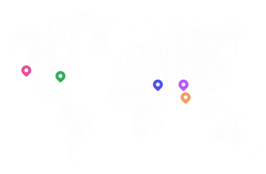
Galaxy UX Studio Map

United States

San Diego

Galaxy Weblinks, Inc. 3526 Buck Ridge Ave, Carlsbad CA, USA 92010

Boston

Galaxy Weblinks, 25 Main St, Suite B North Reading, MA 01864

UAE

Dubai

Galaxy Weblinks, UAE, Capital Building RAKEZ FTZ, Business Park, R3, Al Hamra, Ras Al Khaimah, United Arab Emirates

India

Indore

Galaxy Weblinks, 307 Bansi Trade Center, Indore, MP, India 452001

Madurai

Galaxy Weblinks, Elcot IT Park, Illanthai Kulam, Madurai, TN, India 625020

Enterprise-grade UX design that drives measurable business results. Transforming digital experiences through data-driven design and AI-powered insights.

Service

  • AI-Driven UX Research
  • Product and UX Design
  • Enterprise DesignOps
  • Performance & Accessibility
  • UI and Visual design
  • Assistance Services for Agencies

Company

  • Case Studies
  • Insights
  • About
  • Contact

Other

  • Request a UX Audit
  • Podcast
  • instagram
  • linkedin
  • dribbble
  • youtube
  • Galaxy UX Studio Logo
  • Galaxy Edge Logo
  • Galaxy UX Studio Logo

© 2026 Galaxy UX Studio. All rights reserved

  • Privacy Policy
  • Data Compliance