If you are a designer, you must have come across the term Bauhaus (pronounced as “Bau-house” or “Bau-haws”) at least once so far. If you haven’t, well you have now, and better late than never, right?
So, what is Bauhaus?
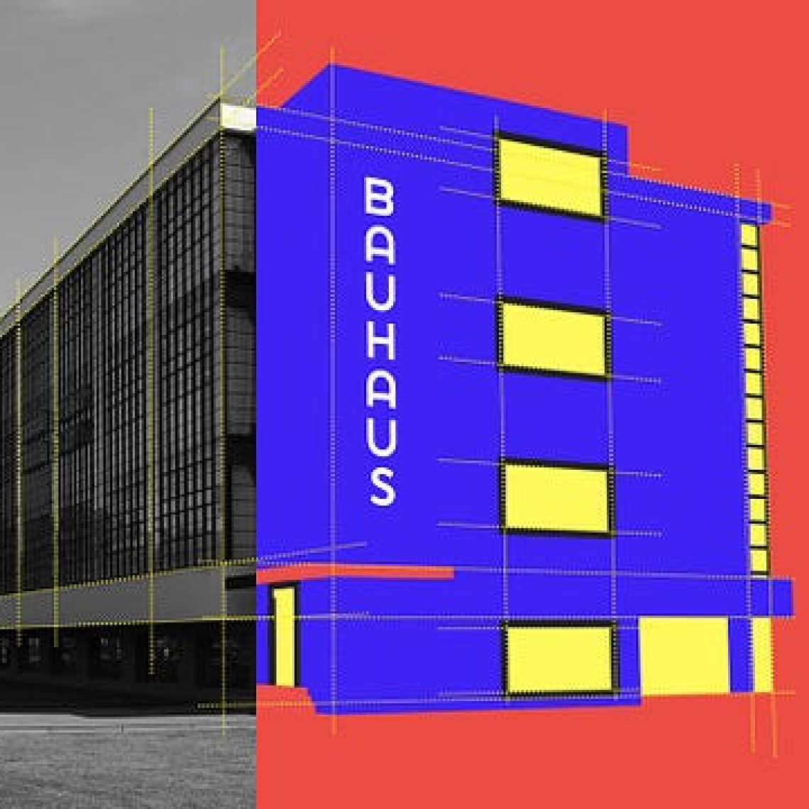
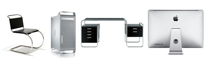
Bauhaus was a school of art and design (literally meaning ‘building house’ in German) founded in 1919 by Walter Gropius in Weimer, capital of World War I Germany. The mission of the school was to create products that respond to the needs of the user, making function the priority over form. If you look at Bauhaus art, it is almost constantly rectilinear (made of straight lines), geometric (made of simple shapes, especially squares), and austere (the opposite of emotional, romantic, and flourished). It was about simplicity and usefulness. Bauhaus very much focused on simplicity and elegance as the basis of modern design. The school played an integral role in the history of design. It was aimed to train artists and craftsmen together. Its impact is still visible to the day, maybe in the form of a typeface we use or a style of button that you used yesterday in your design. It gave designers the position we have today. They recognized designers as more than just artists or decorators and thought they can actually make an impact in society, that they are also as important as craftsmen.
In 1933, when Hitler came into power, the school’s liberal approach made it a target of the National Socialists which led to its shutting down. Many of the key figures of the school like Walter himself emigrated to the US and continued to teach their philosophies there which influenced generations of young architects and designers. Although the Bauhaus school of design only lasted a little more than a decade, no other school of architecture or design has been as influential as the Bauhaus.
Well, all this is great but how exactly are their ideologies relevant to interface design?
To understand this, here are two examples of works done by professors at the school back in the day.
Homage to the Square, 1951
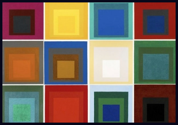
Joseph Albers: Homage to the Square(via Brain Pickings)
This is a work by Josef Alber. Here, we have a collection of 12 paintings. There are 4 squares of equal dimensions in each painting, yes I said EQUAL DIMENSION. They differ only in colors, hues, or tones. This work is so critical because it is linked to color and composition. All squares despite being of the same proportions, our eyes deceive us into believing they are different. He wanted to educate on how things can be perceived differently just by changing their composition or the way they are presented. You must have already used this concept numerous times in your design without even realizing it.
The colors used in light themes seem to have a distinct saturation when used in dark themes, to give one example that comes to mind. We can design a much more effective color palette by understanding how colors are seen by our eyes when combined with other colors.

Can you think of any other applications?
Klee’s Color Course
One of the most famous courses, in theory, was taught by Paul Klee. Here is an imagery from his color course:
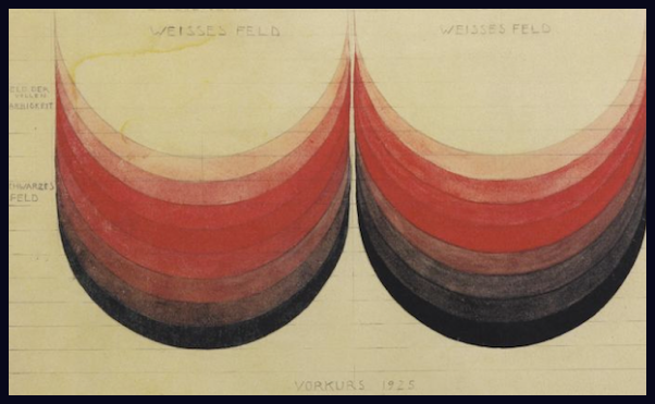
Klee’s Color Course (via 99designs)
This image emphasizes how changing just the saturation values of color, can create a different feeling or impact. We can say, his color course laid the foundation of the color palette we know today. There are so many more theories and concepts that found its root at Bauhaus.
Some Lessons the Bauhaus School can offer today’s interface designers
Form Follows Function
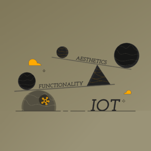
This is one of the most talked about principles of Bauhaus. We should be focusing on enhancing or improving the functionality of the product rather than adding a bunch of decorative elements to make it look aesthetic. All elements in the design should work towards fulfilling the function than just being an ornament in design. If the UX is bad, the product is bad no matter how good you make the UI.
Gesamtkunstwerk
It literally means “Complete work of art”. Bauhaus brought together many different arts and crafts: architecture, weaving, painting, carpentry, and more. Walter described his school as Gesamtkunstwerk, a complete work of art to be experienced as a whole.
How is this significant in UI/UX? In the early days of UI, we had only one color palette (black and green) and one dimension command line. In the past few decades, we have come a long way from this, from 2D interfaces to now with AR and VR we have stepped into the 3D world. With motion design, we are also adding the dimension of time. As we enter into this multi-model, multi-surface, and multi-sensory world, we are increasing our work as enabling a Gesamtkunstwerk, as in we can design an experience that speaks to not just visual but all senses. Computer games are the Gesamtkunstwerk of modernity. Whether it be Fortnite or Minecraft, it transfers the player to a new environment making it their reality for the moment.
It is the complete experience and this is made possible by pulling in the player with different arts like music, visuals, sculpture, and film with the added feature of interactivity to complete the perfect union.
Emphasis on Technology and Constant Development
The Bauhaus embraced science, engineering, and new methods of production. They believed in using technology to our advantage. New technology meant, new possibilities. With better technology we are provided with more possibilities, we get to try new methods and experiment with them, to give new experiences to the users. They stand to remind us that rules and conventions are there to be learned, but not always to be observed. Some design problems call for radical solutions. Try to incorporate different elements into the design using the technology we are given today. Creating a button animation would have been extremely difficult to achieve years back but now it is easily doable.
[..]In a sense, the Bauhaus represents the 20th century — it defined our whole idea of what it is to be modern. What a radical idea it was for a school: this relationship between art and design, architecture, between furniture, graphics, painting, sculpture. Bauhaus tried to bring them all together and, in a true modernist sense, create a utopia. It’s interesting that many of the things they designed were very difficult for them to actually produce. So much of what they did really only became available to people in the 50s and 60s when the techniques for fabrication made it possible — they were so ahead of their time that although these things were meant to be mass-produced, they were unable to at the time. (Craig-Martin, 2019).
Explore creative areas outside of your regular domain and don’t be afraid to get your hands dirty by diving into other techniques, you might find inspiration for your work there. If you are designing an application or website for restaurants, try to find out how a restaurant operates, visit multiple restaurants, observe the environment, understand the business, and don’t forget to enjoy some good food, you will be able to find so much inspiration for your product’s design, you will be able to incorporate the real world elements into your design and find new possible functionalities that you can include in the product to make it better.
Did you know that Steve Jobs took inspiration from Bauhaus to design apple products?
Apple is definitely a brand that has marked its identity in a way no other brand has. But how did they achieve it, and why do their products stand out? They distill a very complex function down to something that appears simple and user-friendly. This is what bridges Apple and Bauhaus design. Sony was one of only a few companies in the 1970s to exhibit a unique industrial design aesthetic. In 1981, when Steve Jobs visited the Aspen Institute designed by the last surviving Bauhaus Master Herbert Byer for the annual International Design Conference, he was exposed to the clean and functional approach of the Bauhaus movement, which was enshrined by Herbert Bayer in the buildings, living suites, sans-serif font typography and furniture on the Institute campus. Two years later, Jobs publicly discussed his embrace of the Bauhaus style in a talk he gave at the 1983 Aspen design conference.
Apple products took the Bauhaus concepts to heart. The design of each product needed to be beautiful and simple. However, most significantly, attractiveness didn’t matter if the product didn’t work or was too difficult for the consumer to use. Form and function work together seamlessly. When assembling the first iMac, Jobs and famous Apple designer Jonathan Ive settled on a translucent shell that displayed the carefully organized circuit board inside. In his 2011 biography of Jobs, Walter Isaacson stated that “Both metaphorically and in reality, the translucency connected the inner engineering of the computer to the outer design.” Like a 21st-century Bauhaus, Apple had pulled together various creative professions and united them into a single product.

Right: Side view of a G3-equipped Apple iMac, made in 2000. Photo by Thomas Kaiser (via Wikimedia Commons) and Left: Sony Watchman Handheld Flat Black And White TV, Model FD-20A. Photo by Joe Haupt (via Wikimedia Commons)
Jobs was also obsessed with typography. Bayer, the man behind the Aspen Institute, had himself designed the classic Bauhaus font that was used on its promotional materials. It was sans-serif, minimal and modern.
“Whether it’s on the device or on the home screen or on the packaging, all of Apple’s branding is consistent and recognizable through this use of typography,” says Emily Orr, the Assistant Curator of Modern and Contemporary American Design at Cooper Hewitt.
You can observe that the fourth-generation iMac and Wagenfeld’s Bauhaus lighting have very comparable aesthetics when compared side by side.
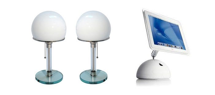
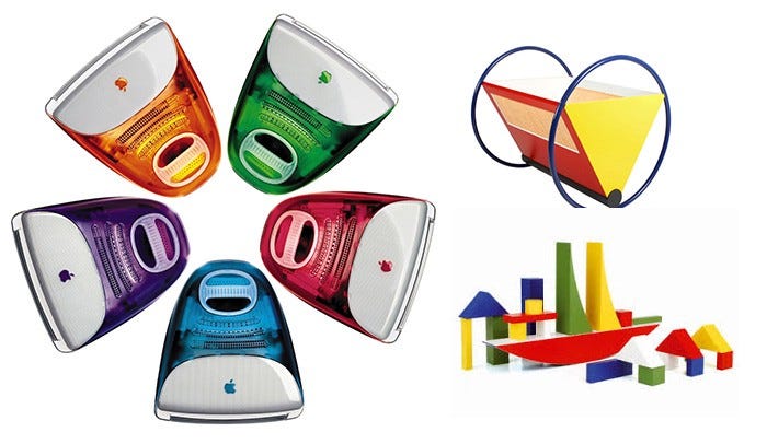
The Bauhaus was also known for its bright primary color palette. An extremely similar color scheme was used in earlier iterations of the iMac. Even though they weren’t primary colors, Apple used these vivid hues in a lot of their designs and stuck to a limited color scheme.
Conclusion
During its time and even now, Bauhaus has faced criticism. When individuals go through them, some claim they are more impersonal, dull, or flat. Others assert that the text’s legibility makes it simpler to communicate the point without exaggerating. Nevertheless, the impact they made can still be seen in our everyday life. Swiss Design, which was influenced by Bauhaus, had an impact on flat designs. As a result, you are constantly creating something new using the conventional principles that Bauhaus introduced. We are still daily inspired and influenced by these design languages.
References:
https://www.artsy.net/article/artsy-editorial-steve-jobs-learned-bauhaus
https://medium.com/@2caleb/apple-the-bauhaus-19582c7d35d2
https://99designs.com/blog/design-history-movements/know-your-design-history-the-bauhaus-movement/
https://blog.google/outreach-initiatives/arts-culture/100-years-bauhaus-google-arts-culture/