The dos and don’ts of UX designing to make your interfaces user-centric and intuitive.
Here are the common UX design mistakes you must avoid while designing a mobile app.
Complex interface
Apps often solve very complex problems for businesses and consumers in the domains such as sales, marketing, finances, etc. But these days, merely offering a product that is solving a problem with its features isn’t enough. If the UI is just as complex as the original problem, the user churn rate is going to be high. In this article, we’re going to look at some tips for designing a simple UI and UX of your solution no matter how complex the problem is.
Figure out your users’ goals so you can design a user-first UI
Avoid unnecessary elements and be clear in the language you use on labels and in messaging. Create consistency and use common UI elements. By using common elements in your UI, users feel more comfortable and can get things done quickly.
While building a simple interface, make sure that all features are made minimalistic and all unnecessary clutter and add-on features don’t take up the primary space on the interface.
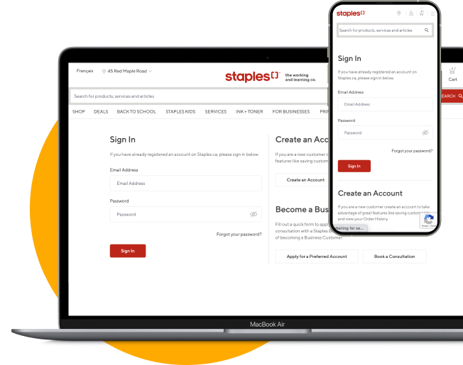
For instance, this interface is very confusing, users have no idea which element is dominant, every component is in the same color, and no hierarchy is established here.

There are some rules to avoid complicating an interface
- Display descriptive messages and text
- Provide immediate and reversible actions
- Make the user interface transparent
- Allow users to customize the interface
- Provide interface shortcuts
- Maintain consistency within and across products
Poor app architecture
An application architecture describes the basic structure and concept used to design and build an application. The architecture gives you a roadmap and best practices to follow when building an application.
But poor architecture will not let the user reach their goals. Users will wonder where to go and which path to follow if the information and functionality are not clear.
You have to take care of the following parts and show them upfront on an app.
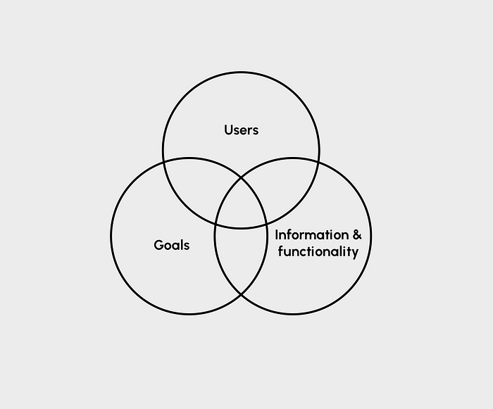
Clear information architecture of your UX design can help you develop digital products that live up to user expectations by helping them achieve their goals in a quick and pain-free manner.
Not checking accessibility
A good design serves a diverse set of users who are going to interact with your products. Studies show that accessible apps have better search results, they reach a bigger audience. Accessible services can have an incredible impact on the overall customer experience, and we urge anyone considering new technology to evaluate its accessibility.
Microsoft is a company that has shown a firm commitment to accessibility in every product they make.
Users might only be able to operate their mobile devices with one hand. Some of their audience might have a permanent disability such as having only one arm. However, Microsoft notes there are also temporary disabilities, such as a broken arm that will eventually heal, and situational disabilities, like using a smartphone one-handed while holding a baby.
These temporary and situational disabilities can impact your audience. Not just those with permanent conditions.
For instance, video captions are critical for deaf users, other viewers might use them while in a noisy room to understand difficult vocabulary.

Accessibility is not just about meeting some guidelines. It’s about making sure that everyone who is going to use your product should feel included and supported by the design. With the right tools, you can help someone accomplish something they’ve never been able to do before.
Disappointing first impression
First impressions matter in your product. It takes just 0.05 seconds for users to form an opinion about your product.

There are some important reasons why your product design leaves a bad first impression.
Too much text
The purpose of having text on your applications is to inform and guide the user through the product. The text should be enough to provide them with a context of use of the product. Overload of text on applications increases the cognitive load and makes the information hard to scan and understand. The best practice is to keep the text minimum and to the point.
Poor search capabilities
The search interface is the means by which users can search through the content of your website. If your users cannot find the content that they are looking for while browsing your site, they will be disappointed.
Pressure for signup
A UX bad practice is designing experiences in a way that forces the user to sign up or subscribe to your service from the moment they onboard your application. This is a rather off-putting practice as it makes the user feel the pressure of subscribing without getting the opportunity to explore your product and decide for themselves. Therefore, it is extremely important to start on the right foot.
Bad structure
It is a known fact that bad usability and bad website layouts annoy users way more than outdated designs. Make sure that you avoid making your design,
Complicated — making it hard for people to understand your design.
Confusing navigation — difficulty in understanding where the visitor should go next on the website or app.
Inconsistent design — pages will look different, throwing users off.
Too many colors
Proper use of color is important for creating a positive image in your users’ minds. That’s why color plays a leading role in interface design. It helps in stimulates users’ senses and establishes an instant connection with your brand and its messaging.
Incorrect use of imagery
Visual stimulant to making a good impression. Bad photos will ruin a design even if everything else looks great. If your design needs photography, only use relevant imagery. Not all images work towards improving the experience, some of them just take up space or even worse, confuse the user. Always use high-resolution and relevant photos on your website to communicate your message and purpose efficiently.
Inconsistency in design
Consistency is one of the most basic rules of good usability because when a product looks, acts, and functions as it should every time, it inspires confidence in the user and keeps them coming back for more.
The consistent design brings order to our lives, we consistently rely on the best apps to organize work tasks.
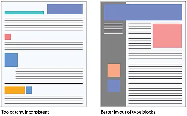
Consistency ensures that every part of a design looks, feels, and operates the way it should, it’s the invisible thread that ties a successful design together.
Summary
This was a practical take on designing better UX inspired by my experience as a UX designer.
These five golden rules of designing interfaces and experiences are promising as they have been shown to have satisfied users in the recent past. The important things to keep in mind are keeping the interfaces organized and clean, having proper architecture, checking the accessibility, making a good first impression, and maintaining consistency in your designs.

