When we start creating any color palette for any design or illustration after completing sketching we stuck in thinking about that are we going to use the right color in our illustration.
Which color palette will be best for the artwork and where to start?
Should I copy the color palette from another artist’s work or should I create it myself?
There are a lot of questions running through our minds.
Once you learn how to use colors in any illustration you will enjoy the process. I personally really enjoy the coloring part of an illustration.
So, today we are going to talk about a few tips to use colors in a design:
1. Understand the concept of illustration
2. Make the color palette
3. Don’t use a lot of colors
4. Check the contrast
5. The color ratio
1. Understand the concept of illustration
The first thing to keep in mind while coloring is which color represents what? For instance, if we are working on a child-related design we always put colors that represent cuteness, and fun so we can use orange, and yellow here.
If we design any education-related illustrations or a design we use blue because blue represents education.
So first of all we have to understand the color theory and the meaning of the colors we are going to use in our artwork.

2. Make the color palette
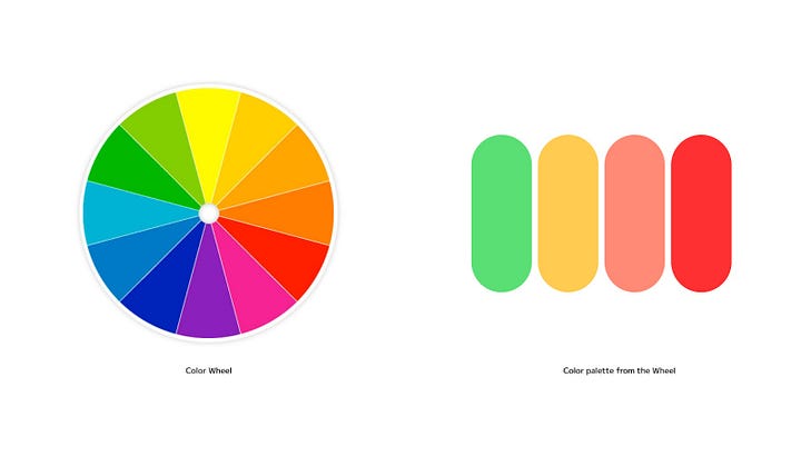
Once we select a primary color we make a color palette accordingly we add their secondary and accent color for instance if we are using blue as a primary color then we can add yellow or orange as a secondary color and green as an accent color. For the other colors just pick the color wheel. There are 12 main colors on the color wheel red, yellow, orange, chartreuse green, green, spring green, cyan, azure, blue, violet, magenta, and rose.
The color wheel is divided into primary, secondary, and tertiary colors. You can pick any colors from the color wheel as well.
Or if you are a beginner in making a color palette, copy from the pro designer’s work or just search on the internet and you can collect palette images that you can use in your artwork but keep in mind what emotion you want to convey from your artwork.
3. Don’t use a lot of colors
If you find 2–3 colors of palette you are good to go. Illustrations don’t require a lot of colors. Simply put 2–3 or 3–4 colors in the illustrations to make them visually appealing. 2–4 colors are best to execute the coloring part of any illustration but still, if you find difficulties to make a color palette on your own then take inspiration from other good designs or there are some online color generators available.

4. Check the contrast
If any design has the right contrast it creates uniqueness. It tells the story to an audience well, makes the composition of the illustration better, and draws attention as well. Contrast is the most powerful tool in any design.
If you create any design with colors, convert that into greyscale as well so that you can check the contrast of the design. if the design looks good and has clarity(everything is clear in the design) in greyscale the design will look good automatically in colors too.

“As a principle of art, contrast refers to the arrangement of opposite elements and effects. For example, light and dark color, large and small shapes”
Contrast creates drama and variety in any design.
5. The Color ratio
It’s a very simple one and I also mentioned in my previous article that when you choose the color palette for your designs the primary color should be used 60%, the secondary 30% and the third or accent color should be used for the remaining 10% of design.

Conclusion
To create visually appealing designs, it’s crucial to consider the use of color. By adhering to these color principles, we can enhance the overall look and feel of our designs. In conclusion, when it comes to creating a color palette for any design or illustration, there are several things to keep in mind. It is important to first understand the concept of the illustration. Select the color, once a primary color is selected, a color palette can be created with secondary and accent colors. It is recommended to fix the number of colors, as this is usually enough to make the illustration visually appealing. Checking the contrast and using the right color ratio are also important aspects of creating a successful color palette. The shared tips and principles of art, designers, and illustrators can enhance the overall look and feel of their designs.