Problem
The existing website had loads of UX issues that came in the way of the website's smooth performance. Here are the major problems with the existing B2B e-commerce platform.
- The checkout process & other vital flows were cumbersome and resulted in reduced conversions.
- Being an old website, the UI looked dull, bland, and old.
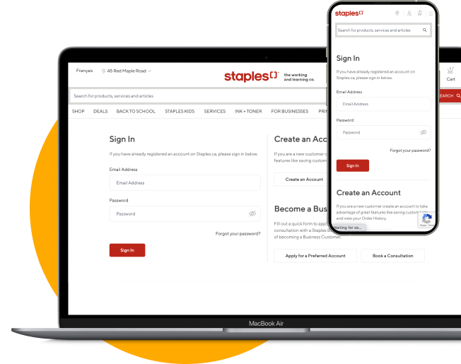
- The website wasn’t accessible over mobiles & tablets due to outdated code.
- Glimpses of Staples’ brand identity was visible at some places but wasn’t consistent across the visual style of the site.
The issues would have resulted in potential business loss if left unaddressed for too long. Staples realized this and acted promptly by onboarding Galaxy to help them with the situation.
Solution
In the initial stages of the project, Galaxy created designs & user flows based on the user stories provided. As the project progressed, we started suggesting crucial tweaks that could enhance the overall UX. Suggestions made were liked by Staples, and they wanted us to assist them completely with designing the experience.
This was a component delivery-based project originally scheduled for a duration of six weeks. We simplified the checkout process for users, overhauled the homepage, and delivered design options for various viewports. We also improved UX & UI for components that are vital for a B2B e-commerce store, namely group order, order management system, and shopping list management. We created a style guide for Staples along the way, too.
Staples acknowledged the level of support & wanted to collaborate even more, so they extended the number of deliverables to forty which were initially six. This resulted in an extension of the project by twenty-two weeks.


